

UW Blueprint x Sistema Toronto
Streamlining absence tracking through digitization and automation
I led the end-to-end product design of Sistema Tacet, an EdTech absence management platform serving 50+ teachers across 6 locations. The project focused on reducing administrative overhead and empowering teachers with more control over their schedules. I drove user research and system design in both teacher and admin-facing experiences.
My Role
Product Designer
Team
2 Product Designers, 2 Product Managers, 7 Developers
Timeline
2024 - 2025 (12 months)
20%
administrative overhead reduced
200+
absences logged since adoption
Who's Sistema Toronto?
Sistema Toronto is a NPO dedicated to providing accessible and high-quality music education to youth from underserved communities.
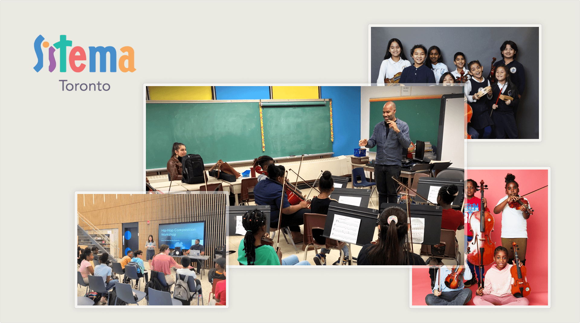
Sistema Toronto Programs and Offerings
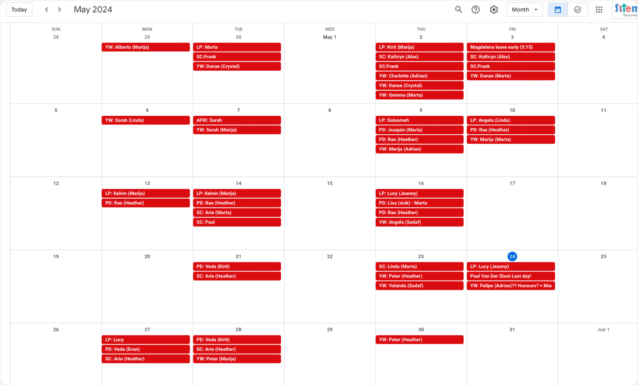
There's a bottleneck…
Administrators don’t have the time to process teacher absences and manually find substitutes for teachers, so the current process is inefficient.
Administrators spend too much time processing absences
The administrative team spends 2-4 hours per week manually monitoring and transferring Google Form data into calendars, which is not only slow, but error-prone.
Teachers have little control over their own schedules
Teachers must rely on admins to connect them to substitute opportunities which may be inconsistent and unreliable.
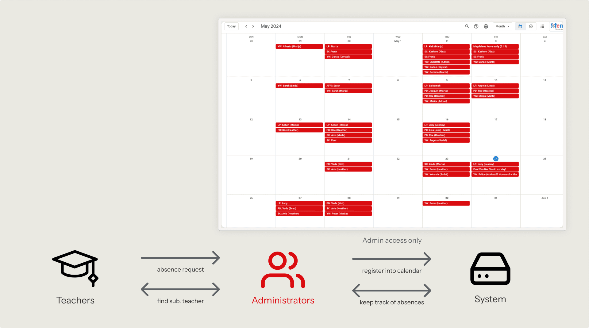
Sistema Toronto current management system, relies heavily on administrators to facilitate
Building a solution
Sistema Tacet, an optimized absence management system that reduces administrative overhead, and enhances visibility of teacher availability.
WHAT'S OUT THERE?
To make sure we aren't creating something that has already been made, we took a look at the pros and cons of the current market of the most popular apps that could be used within the Sistema team for absence tracking.

Google Calendar
✅ Syncs with their existing system
❌ Poor visibility (teachers are in the dark)

Outlook Calendar
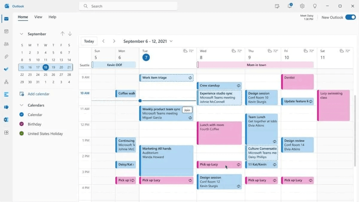
✅ Has good widget states
❌ Not designed for absence management

Notion Calendar
✅ Highly customizable to meet needs
❌ Too complex for the demographic
Time to map it out
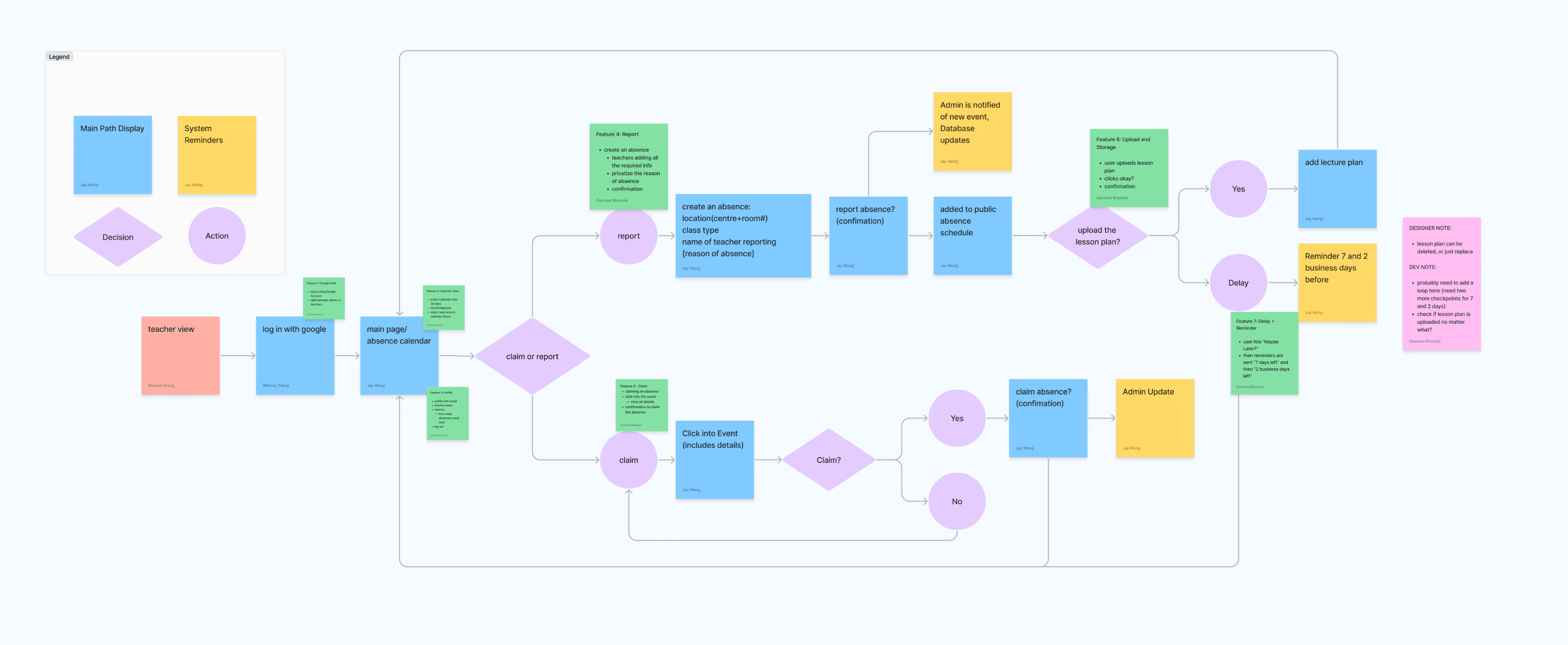
Initial User Flow & Feature Scoping
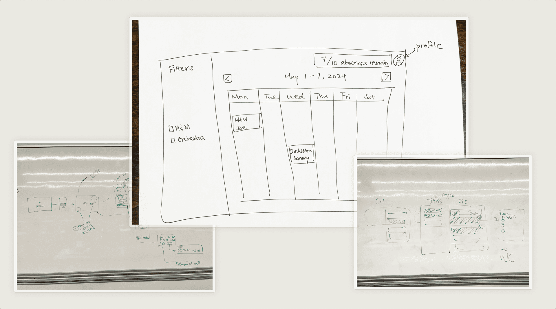
Initial Sketches of the Calendar
Uh-oh…
The first roadblock we hit was the decision of whether to choose the conventional calendar navigation (left-right flip), or use a vertically scrolling calendar instead.
Flip from Left-Right Calendar

❌ Cannot show all absences in this view
❌ Increases friction when looking for a nested absence
Vertically Scrollable Calendar

✅ Responsive to quantity of absences
Gathering feedback
After our lofi screens were complete, we conducted user testing and the results led us to new problems to solve.
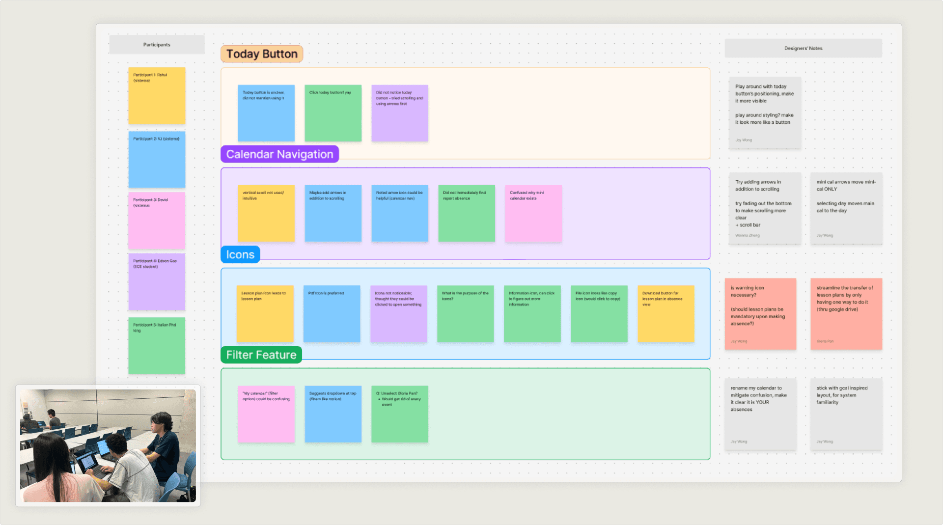
Conducting and synthesizing user testing results
FINDINGS

Overcomplicated widget states & icons
Teachers struggled to differentiate multiple calendar states. The meaning behind filled vs. unfilled absences, circles, and outlines was unclear.

Unclear filtering system
The label "My Calendar" was unclear, combined with other filters, the system became overly complex.
Back to the drawing board
THE MAIN VIEW
After conducting the user tests, we found that many of the problems came back to the same problem of poor information architecture. We revisited the primary tasks that the teachers had, and found that they would be going on Tacet to either (1) declare and absence or (2) fill for another teacher. We decided to split those two tasks into separate calendars.
Information Overload
❌ Filter system is unclear
❌ Shows too many absences in one view for a teacher
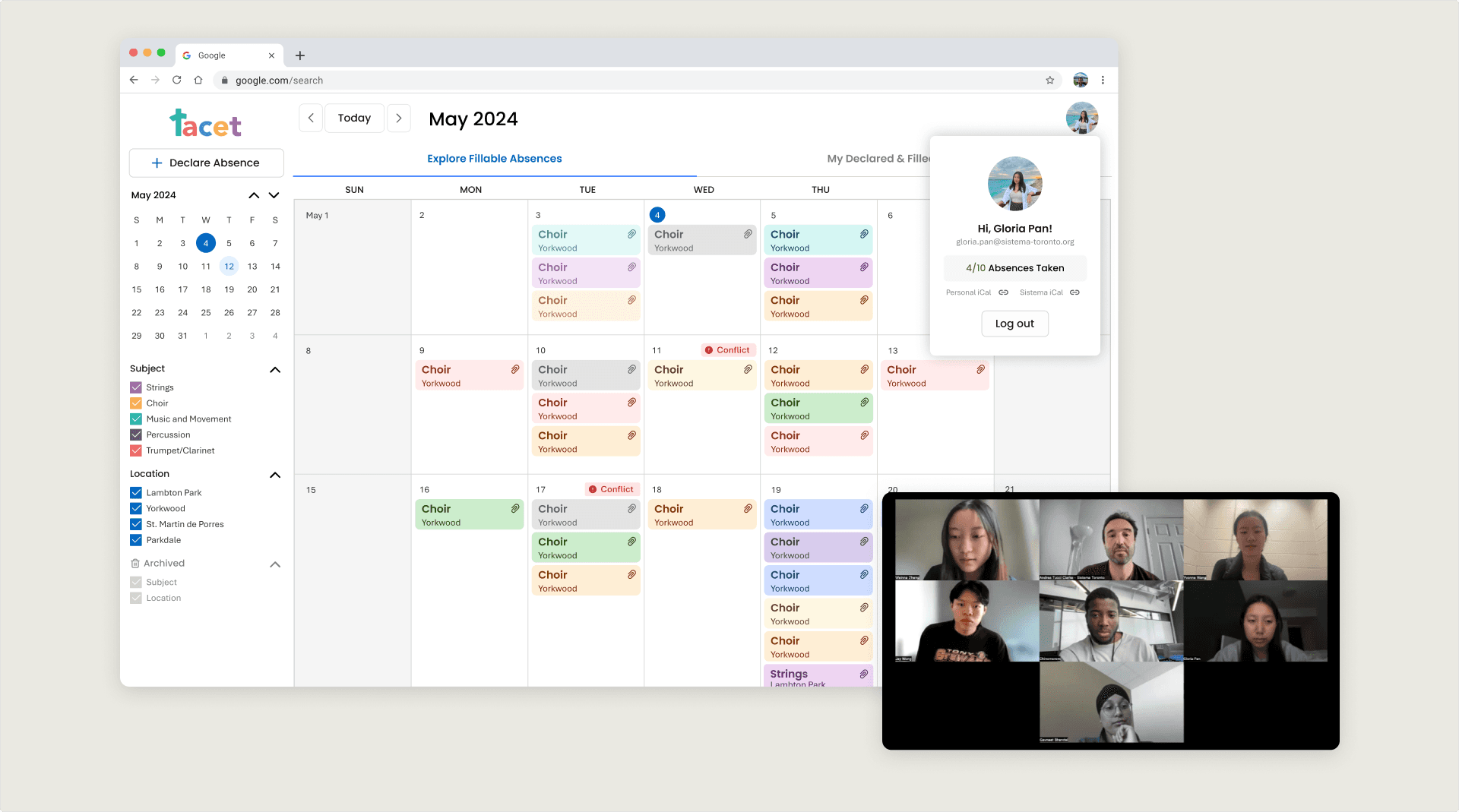
Views Separated by Primary Tasks
✅ No more clutter for teachers
✅ Clear distinction between your absences and others
WIDGETS
After multiple brainstorming sessions, we explored various options and landed on a clearer way of communicating the information on the widget, mainly the teachers filling for an absence, and the use of icons.
Before

❌ Insignificant design decisions
❌ Misleading Icons (button? or status marker?)
After

✅ Not just relying on visual cues
✅ Intuitive icon placement, consistent visuals
Managing stakeholders
It was very important to us that we had multiple touch points with the Sistema staff to ensure that we were meeting the product requirements, and that we were truly building a tool they could sustainably use for the future.
Stakeholders product check in
Refining the system
The system uses playful colors representing sistema values & cause helping children around the GTA. The colors all meet the WCAG standards (high contrast on text, color contrast on widgets for each color, color is not the only identifier)
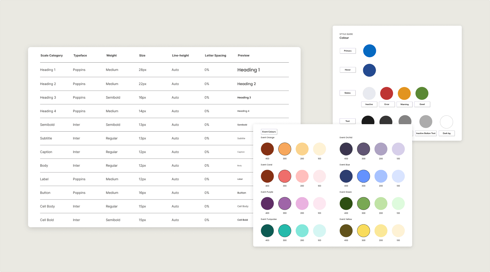
Sistema Tacet design system
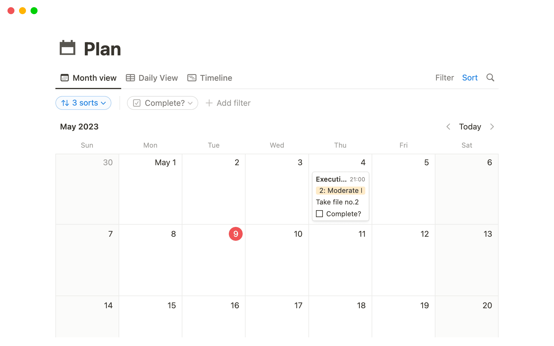
Presenting… Tacet!
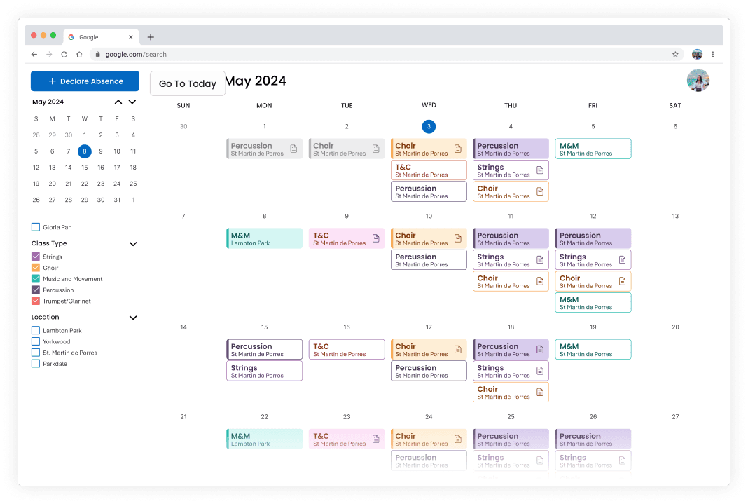
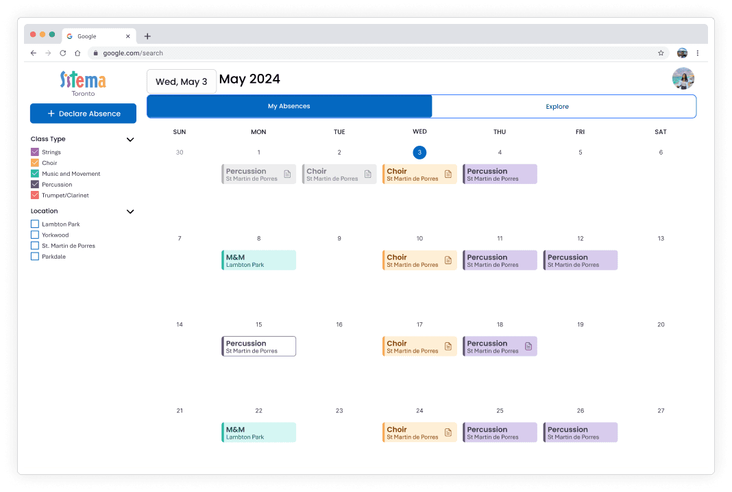
Teacher View: Declare & Fill Absence
Teacher View: Filter & User Profile
Admin View - Toggle & Dashboard
Reflections

Working Cross-functionally
I learned a lot from working in a team of diverse skillets, specifically working alongside developers.
Product Thinking
Thinking about the whole system, not just a platform and it's screens.

Non-linear Progress
Design is never linear, after learning new things from testing, iterations and changes will be made.